
Glossary term
Internet Explorer 6 CSS Hacks
Internet Explorer 6 CSS hacks were workarounds that made layouts behave in a browser that often needed its own set of instructions. A stray underscore, a one-percent height, or an extra stylesheet could be the difference between a finished page and a broken one.
These were the last-mile fixes behind a lot of polished websites. The layout was built, the type was in place, and then IE6 moved a column or swallowed a paragraph. The hacks below show what developers changed to get the intended design onto the screen. These examples show the period techniques and the results they were meant to produce.
Box Model Hack
A two-column layout depended on the arithmetic adding up. Under the standard content-box model, a 200-pixel box with 10 pixels of padding and a 1-pixel border on each side occupied 222 pixels. Older IE’s alternative model put the padding and borders inside that 200 pixels. A carefully measured column could suddenly be too narrow.
Tantek Çelik’s original box model hack worked around IE5 for Windows. IE6 could use the standard model with an appropriate doctype, but retained the older behavior in quirks mode. That distinction mattered: sometimes the right fix was getting the document into standards mode before adding more CSS.
/* Same declaration, different box arithmetic. */
.box {
  width: 200px;
  padding: 10px;
  border: 1px solid;
}
/* Standard content-box: 222px overall.
   Old IE box model:   200px overall. */
The goal was predictable column widths. This illustrates the mismatch; it is not the original Tantek parser hack.
Conditional Comments
One practical response was to give IE6 a stylesheet of its own. The main design stayed in the shared CSS; the extra file held the adjustments needed to keep the same columns, spacing, and images working in IE6.
Microsoft’s conditional comments made that possible without sending those adjustments to every browser. Placed in the HTML head, this example loaded the repair sheet only in IE6. Other browsers read the wrapper as an ordinary comment and skipped it.
<link rel="stylesheet" href="site.css">

<!--[if IE 6]>
<link rel="stylesheet" href="ie6.css">
<![endif]-->
The HTML wrapper chose the browser; ie6.css contained the actual fixes.
CSS Expressions
IE6 lacked CSS sizing features that designers wanted for flexible layouts, including min-width and max-width. Expressions let an author put a JavaScript calculation into a CSS value. A page could resist becoming too narrow, or an image could shrink to fit its column.
This simplified example holds a page at 800 pixels when the viewport gets narrower. The result helped keep navigation and columns from collapsing, but the browser could repeatedly evaluate expressions as the page was used. A layout fix could become a performance problem.
/* In an IE6-only stylesheet. */
.page {
  width: expression(
    document.documentElement.clientWidth < 800
      ? "800px"
      : "auto"
  );
}
A minimum-width workaround for an IE6 page running in standards mode.
hasLayout
Some IE bugs seemed unrelated to the rule you were changing. Text went missing, a background stopped painting, or a container behaved differently after you assigned it a width. One explanation was hasLayout, an internal IE state that changed how an element took responsibility for its contents.
Triggering that state could make a broken element render correctly. A common later workaround, zoom: 1, could switch on hasLayout without visibly enlarging the element. It was an implementation switch disguised as a styling declaration.
/* In the IE-specific repair sheet. */
.panel {
  zoom: 1;
}
A layout trigger that leaves the element at its original visual scale.
Star HTML Hack
An author often needed one adjustment to reach IE6 without changing a page that already looked right elsewhere. The star-HTML selector provided that hook. In a normal document there is no element above html for the initial star to match, but IE6 for Windows and earlier versions still applied the rule.
The example shifts a sidebar only in the affected IE versions. The selector did not repair the browser by itself; it gave the developer somewhere to put a measured correction. It is different from the star-property hack, which could also reach IE7.
.sidebar {
  margin-left: 20px;
}

/* IE6 for Windows and earlier. */
* html .sidebar {
  margin-left: 10px;
}
IE6 receives a 10-pixel margin; standards-compliant browsers keep 20 pixels.
Underscore Hack
Sometimes the browser-specific correction was tucked directly beneath the regular declaration. IE6 for Windows accepted an underscore before a property name and applied the value anyway. Standards-compliant browsers ignored that unknown property.
Here, most browsers use a width of 200 pixels, while IE6 uses 198. Those two pixels could be enough to stop a column dropping beneath its neighbor. The compromise was maintenance: a future edit had to account for both values.
.column {
  width: 200px;
  _width: 198px; /* IE6 override. */
}
The underscore chooses which browser receives the correction. The required width depended on the layout.
Holly Hack
Named after Holly Bergevin, the Holly hack used a tiny height to trigger hasLayout in older IE. It became a familiar answer to a family of float and rendering problems: the container finally painted or sized as expected after this apparently unrelated change.
The one-percent height was not intended to squash a content box into a thin strip. In the affected IE behavior, the box could grow with its contents while the height declaration switched on layout. The short form below shows the IE6 mechanism; historical variants also included a comment filter to keep IE for Mac out.
/* Short IE6/Windows form. */
* html .content {
  height: 1%;
}
The box could grow with its content while the height declaration triggered layout.
Peekaboo Bug
The name was literal: text could disappear beside a float and reappear when the user scrolled, resized the window, or selected the missing area. The words were still in the HTML. IE had failed to paint them reliably.
One workaround was to give the affected container layout, including through the Holly hack above. Other cases responded to positioning changes. The useful result was wonderfully basic: the visitor could see the paragraph. The exact fix depended on the combination of floats, backgrounds, and containers that exposed the bug.
Doubled Float Margin Bug
A left-floated element with a left margin could end up with twice the requested margin in IE6. Twenty pixels became forty. With float-based page layouts, that extra space could push a neighboring column onto a new row and wreck the whole composition.
The memorable fix was display: inline on the float. It sounds as if it should undo the layout, but a float still established its floated box. In affected IE, the declaration stopped the margin doubling. The same principle applied to a right float with a right margin.
.sidebar {
  float: left;
  width: 180px;
  margin-left: 20px;
  display: inline; /* Stops IE6 doubling the margin. */
}
The desired result: the specified 20-pixel margin, with the sidebar still floated.
IETester
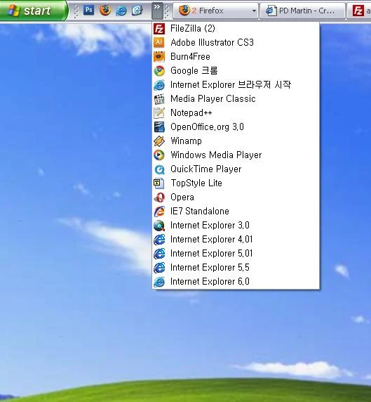
A fix was not finished when it worked in the developer’s usual browser. It had to survive the versions people actually used. IETester brought several IE rendering engines into one Windows application, making it easier to compare the same page without moving between computers.
That made the edit–reload–compare routine quicker: did the IE6 repair work, and had it broken IE7? The project documented limitations around features including focus, dialogs, and filters, so a difficult bug could still need checking in the original browser environment.
MultipleIEs
Windows normally made it awkward to keep several versions of Internet Explorer installed together. MultipleIEs packaged older versions for side-by-side use, giving developers a way to revisit a page in more than one IE generation on the same machine.
The payoff was practical: check the old version, make the adjustment, then check the newer one again. Shared Windows components meant these setups were not perfectly isolated copies of every historical environment, but they reduced the friction of testing the browser you wished everyone had stopped using.
PNG Transparency Fixes
A soft shadow or translucent logo could look beautiful in the design file and arrive in IE6 with an ugly solid background. The problem was PNG alpha transparency: those partially transparent edge pixels were supposed to blend with whatever sat behind the image.
Microsoft’s AlphaImageLoader filter gave developers a way to draw that image with its transparency. A typical background-image fix removed the ordinary background in the IE6-only stylesheet and asked the filter to paint the PNG instead. The result could preserve the shadow or curved edge, though filters brought their own rendering and interaction quirks.
/* Shared stylesheet. */
.logo {
  width: 240px;
  height: 80px;
  background: url("logo.png") no-repeat;
}

/* ie6.css, loaded with a conditional comment. */
.logo {
  background: none;
  filter: progid:DXImageTransform.Microsoft.AlphaImageLoader(
    src="logo.png", sizingMethod="crop"
  );
}
This example treats the logo as a CSS background. Fixes for an actual img element needed additional handling.
Ephemera
Related reading
 The hidden grid
Table-Based Layouts
Table-based layouts use HTML table cells to arrange a webpage’s navigation, images, and text rather than to present tabular data.
 THE BROWSER ALLEGIANCE
Best Viewed In Badges
Best Viewed In badges are small website graphics that recommend a browser, screen resolution, or other viewing condition. Common personal-web examples promoted Netscape Navigator, Internet Explorer, or an 800-by-600-pixel display.
 ALL THIS FOR A HEADLINE
sIFR
After years of cutting headlines into images, custom type could finally follow the words.
Sources
QuirksMode: conditional comments
Roger Johansson: Internet Explorer and the CSS box model
Ethan Marcotte: Fluid Images, including IE6 sizing and PNG workarounds
IETester: project documentation and known limitations
Dan Cederholm: Bulletproof Web Design, including the Holly hack